Palmlingo
Role
UX Research
UI Design
Usability Testing
Deliverables
Mobile App
Duration
4 weeks
Tools
Figma
Useberry
Industry
Education

INTRODUCTION
Palmlingo is a sign language app designed to bridge communication gaps between Deaf users and non-signers through real-time translation and accessible learning. This case study focuses on designing the learning experience, informed by research and usability testing.
CHALLENGE
Deaf users and sign-language learners lack a simple, reliable way to communicate with each other in real-world situations.
The challenge was to bridge the gap between sign-language learning and real-world communication by creating a single, intuitive product that serves multiple user groups without compromising accessibility.
MY ROLE & SCOPE
The Learning Experience
My design focus was on the learning flow, where users want structured, low-pressure guidance rather than speed or accuracy alone. The learning flow supports users who want to gradually build sign language skills through guided lessons, practice, and feedback. The goal was to make learning feel approachable, engaging, and repeatable.

Easy Onboarding: Translator vs Learner
Users are guided to select whether they want to translate or learn from the very first screen. This ensures they only see the tools and lessons relevant to their goals, reducing cognitive load and improving adoption.

Sign to Text
Image capture converts user’s sign language into text in real time. Enables smooth conversations for Deaf users with non-signers.
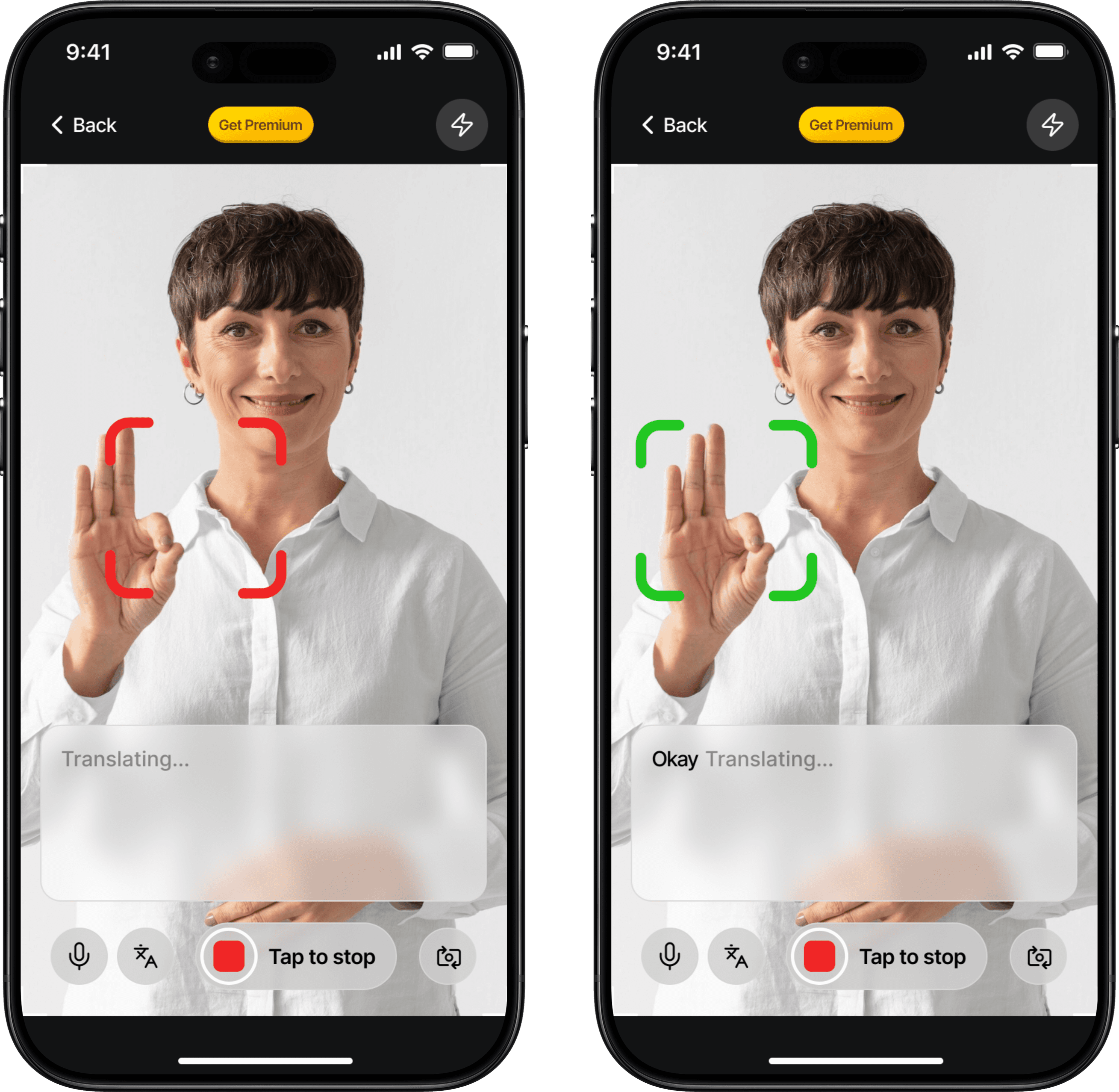
Colour Coded Confirmation Feedback
Visual cues let users know messages were understood. Reduces miscommunication and frustration.
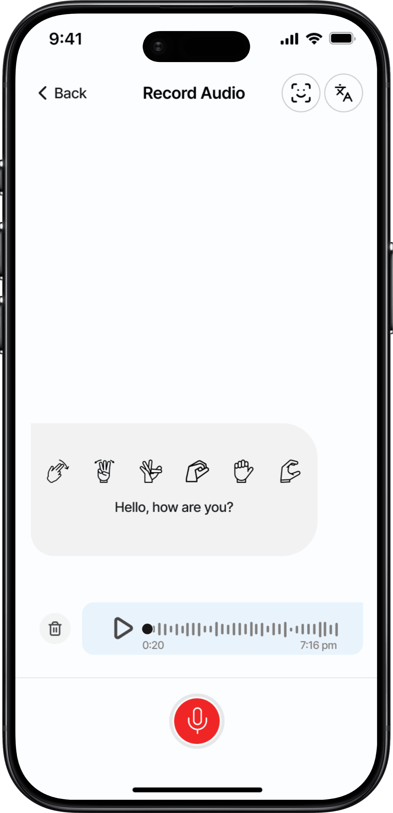
Audio to Sign
Non-signers can speak, and the app shows it in sign language. Bridges the communication gap instantly.

Quick Conversation Mode
Optimized for public interactions with minimal setup. Reduces friction in everyday real-world conversations.

Text to Sign
Non-signers can type, and the app shows it in sign language. Bridges the communication gap instantly.
RESEARCH
How might we help non-signers learn and communicate sign language better?
Before designing, I focused on understanding what successful communication looks like for users. I researched all types of users and organized research insights through an affinity map, highlighting patterns and key needs.
By studying how non-signers naturally communicate, including body language, facial expressions, lip reading, and hand gestures, I translated these cues into a framework for seamless interaction between signers and non-signers on the app.
The goal was to recognize how our target users would react to sign language in a situation where things were not understood. There were two main users to consider:
Translator
Deaf users or non-signers who need to communicate immediately with someone who doesn’t share the same language. The user needs a smooth conversation without awkward pauses or misunderstandings.
Learner
Family members, friends, caregivers, or anyone motivated to learn sign language to communicate more confidently over time. The user wants the ability to communicate without relying on translation tools.
Affinity Map
Cognitive & Linguistic Factors
Language fluency
Grammar differences
Environment noise
Lighting conditions
Speed of interaction
Social setting e.g restaurant, ublic space, etc
Communication Context
Environmental noise
Lighting conditions
Speed of interaction
Social setting e.g restaurant, public space, etc
Cultural and regional issues
Technological Factors
Camera accuracy and lag
Internet connectivity
Device position
UI accessibility
Primary Research
Through research, we found that most sign language app users fall into two groups: those who want to translate sign language and those who want to learn sign language.
We conducted interviews via a video call with 2 sign language app users, to better get an understanding of who we were designing for.


Observational Field Study
To design an effective sign language learning experience, I needed to understand how people naturally communicate when they don’t share a common language. Rather than relying only on interviews, I conducted an observational study to capture real, unspoken behaviours.
This observational study combines non-intrusive, real-world observation of a Deaf user during a public interaction with secondary research from publicly available videos and online Deaf communities. No personal or identifying data was collected. The focus was on communication behaviours rather than individuals.
Observational Example 1: Giving Directions Without Words
Scenario: Two people attempt to give directions without speaking.
Observed Behaviours
Pointing and directional hand movements were used first
Gestures were exaggerated for clarity
Facial expressions signalled emphasis or urgency
The “listener” nodded or mirrored gestures to confirm understanding
Insight
Visual cues and confirmation gestures play a critical role in successful communication.
Design Implication
The learning experience should emphasize clear hand movements, facial expressions, and visual confirmation over text-heavy explanations.
Observational Example 2: Ordering in a Public Place
Scenario: A Deaf user places an order at a public counter while interacting with a hearing cashier.
Observed Behaviours
The user rarely spoke, not due to inability, but because signing felt more natural from daily use.
When unable to hear the cashier, she signalled misunderstanding by placing her hand near her ear.
Eye contact was maintained throughout the interaction
Close attention was paid to mouth movements and body language
Partial lip reading helped infer some spoken words
The user demonstrated a strong sense of independence and preferred not to receive help unless requested
Insight
For Deaf users, communication is inherently visual-first. Listening happens through eye contact, facial expression, lip movement, and body cues.
Speech may be possible, but signing often feels more intuitive and efficient.
Design implication
Learning experiences should prioritize visual clarity, including facial expressions and body positioning.
Sign demonstrations should include expressive facial cues, not isolated hand movements.
Interfaces should respect user independence, offering guidance without being intrusive.
Supporting awareness of lip reading can complement sign language learning
These observations reinforced that communication without shared language is inherently visual, expressive, and iterative. Successful interactions rely on clarity, repetition, and feedback; principles that directly informed the design of the sign language learning flow.
“The thing is, some of our patients don't speak with their mouths; they do it with their hands. Although not only that! They also use facial and body expression and sometimes vocalizations with or without sound. That is, they speak in sign language.”
source: https://claso.net/en/blog/are-deaf-people-unable-to-speak
From Observation to Interface
To broaden understanding, I supplemented this study with secondary research by:
Watching publicly available videos of Deaf individuals communicating across different contexts and age groups.
Exploring online Deaf and sign language communities to observe how signing is used globally
These observations reinforced the importance of expressive, visual, and respectful communication design in my wireframe and design decisions shown below
The first version of the learning interface was based on primary and secondary research, with major inspiration coming from the observational study, online and offline:
Watching publicly available videos of Deaf individuals communicating across different contexts and age groups.
Exploring online and offline Deaf and sign language communities to observe how signing is used globally
These observations reinforced the importance of expressive, visual, and respectful communication design in my wireframe and design decisions shown below
Observation 1: People rely on exaggerated hand gestures
Clear, deliberate gestures informed the use of slowed, repeatable sign demonstrations
Large hand movements
Sign animations play at reduced speed by default
Real time sign identification
Users can restart gestures/signing

Observation 2: Communication is step-by-step
Breaking communication into manageable steps reduces cognitive load.
Easy Translation Screens
Individual signs per text
Actions should be broken into smaller units

Observation 3: Confirmation signals understanding
Soft feedback reassures learners without interrupting flow.
Visual Confirmation Feedback
Subtle acknowledgment cues
Visual cues highlight hand position or movement path

Observation 4: Misunderstanding triggers iteration, not explanation
Visual hints replace verbal correction to keep learning intuitive.
User Guidance
“Try again” without penalty
No text-heavy error messages or learning guides
Colour-coded error messaging
Visual progress feedback rather than correctness pressure

MARKET RESEARCH
Competitor Analysis
To understand the existing landscape of sign-language and accessibility tools, I analyzed direct and indirect competitors across sign-language translation, learning platforms, and communication aids.
The goal was not to replicate existing solutions, but to identify gaps where Palmlingo could deliver greater clarity, inclusivity, and usability.

USER RESEARCH
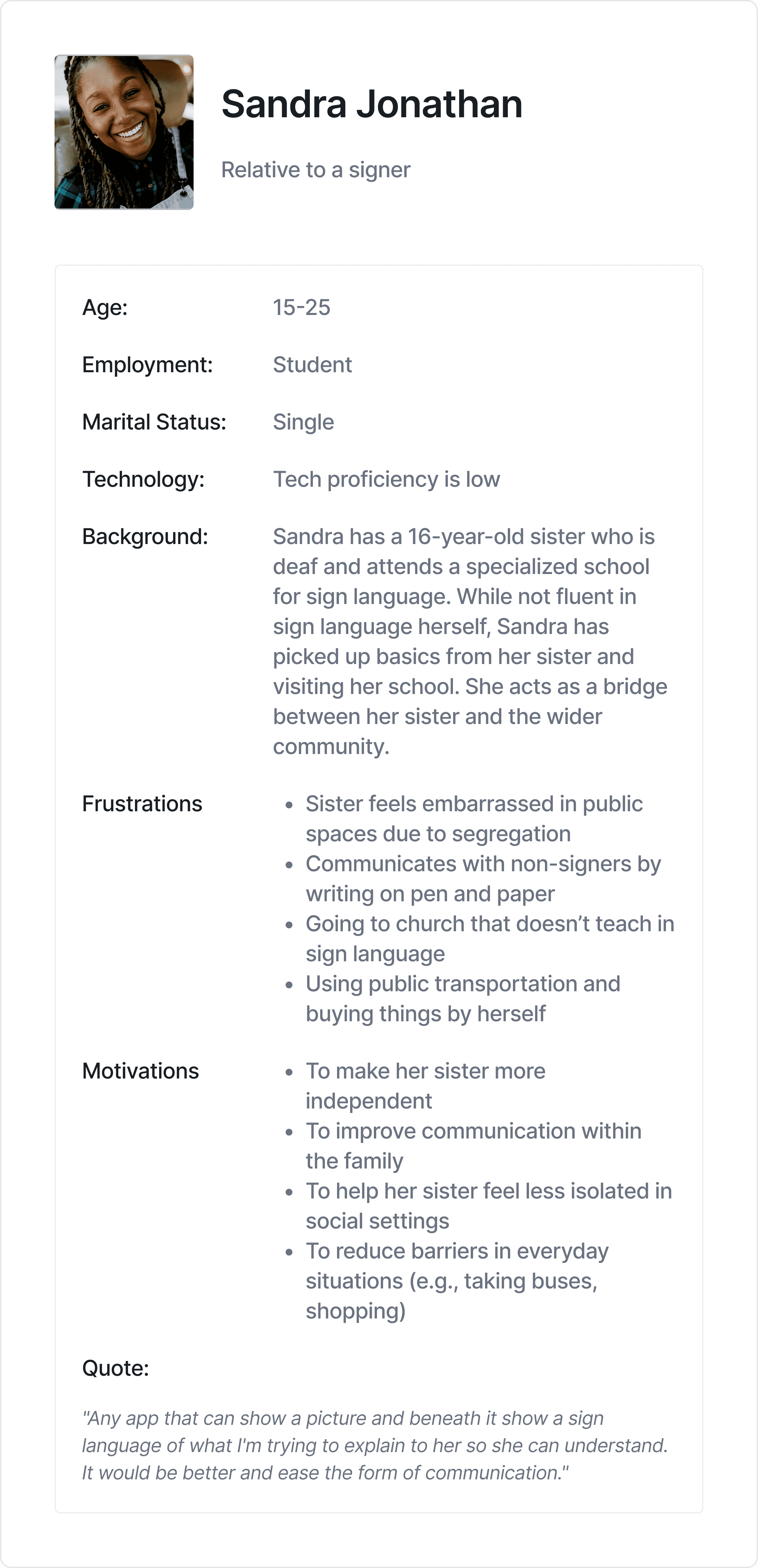
Defining Personas
Through research, we found that most sign language app users fall into two groups: those who want to translate sign language and those who want to learn sign language.
We conducted interviews via a video call with 2 sign language app users, to better get an understanding of who we were designing for.
Translator User
Demographics
15 - 25
Student
Sibling to a 16 years old deaf girl
Tools
Pen and paper
No apps
Challenges
Embarrassed to communicate in public with her sister. Having to communicate with pen and paper
Background
Her 16 year old sister has been deaf from birth. They are able to understand her her when she shows them images of what she means
Needs/Wants
She wants to be able to communicate easily with her sister. She wants others to be able to do the same
Learner User
Demographics
25 - 35
Employed
Lives in an Urban area
Tools
A sign language translator app
Challenges
Afraid to start a new learning journey and not finishing
Ineffective sign language apps
Background
Had an aunt who was a sign language tutor
Tried learning sign language in the past
Needs/Wants
Wants to learn sign language in 4 months
Wants to be able to sign generally
Personas
We had two primary personas who had two primary goals in mind: Learn Sign Language & Translate Sign Language.

User Flow

User Interviews
We did interviews with about 4 users, which allowed us gather information about their pain points, expectations, and goals.


USABILITY TESTING
Testing with Users
Aim
Evaluate the usability of Palmlingo’s key features in order to identify friction points, understand user expectations, and improve user satisfaction and retention.
Objectives
Assess ease of use and clarity of Palmlingo’s core translation and learning features.
Uncover potential frustrations or drop-off points in the user journey.
Validate how well the app supports:
Users learning sign language.
Users translating sign language (e.g. in real-time situations).

6 Users
Sign Language Learners: 4
Users trying to translate sign language: 2
Testing type:
Moderated, remote (Google Meet, Google Forms), prototype interaction via Useberry for heatmaps and screen recording to see the user actions and behaviors.
Proposed recommendations:
Use familiar icons (1/4 users misunderstood the ‘flash’ icon)
Improve clarity during camera-based sign input with progress or completion indicators.
Expand tap targets to include related icons and adjacent white space when appropriate
Provide clearer visual feedback or hover states (e.g., button shadows, highlight effects).

Scenario 1: Ordering food at a cafe
Scenario 1: Ordering food at a cafe
Scenario 1: Ordering food at a cafe
Prompt:
"You’re ordering food at a café. Use the app to communicate with me as if I’m the waiter.”
Tasks:
Launch Palmlingo
Use the camera-to-sign feature to sign or understand a message
Communicate intent clearly using the app
Observed behavior:
Most users navigated to the camera feature easily. Some users struggled with knowing when the app was recording or interpreting
Key quotes:
“The translation screen was easy to understand, but I misunderstood the flash icon, maybe it’s just me”
Scenario 2: Complete a learning course
Scenario 2: Complete a learning course
Scenario 2: Complete a learning course
Prompt:
"You want to learn sign language to communicate better with your Deaf friend."
Tasks:
Access learning content
Play a game or interactive module
Test out knowledge using translation screen
Observed behavior:
[✓] Users found the “Learn a new sign” section engaging and clear
[✗] Some usability issues with button size action area
[✓] High engagement with Learn section
Key quotes:
“I liked the progress lines in the learning section. The only suggestion I have is maybe you can add a topic on “Objects” in the learning section of the app”
During testing, multiple users attempted to interact with icons and white space within interface frames.
However, only the designated buttons were interactive. This led to confusion, pauses in task completion, and repeated tapping.


DESIGN SYSTEM
Visual Identity
The colours used for the Palmlingo app were chosen to create a cool, warm, and inspiring experience for the users.
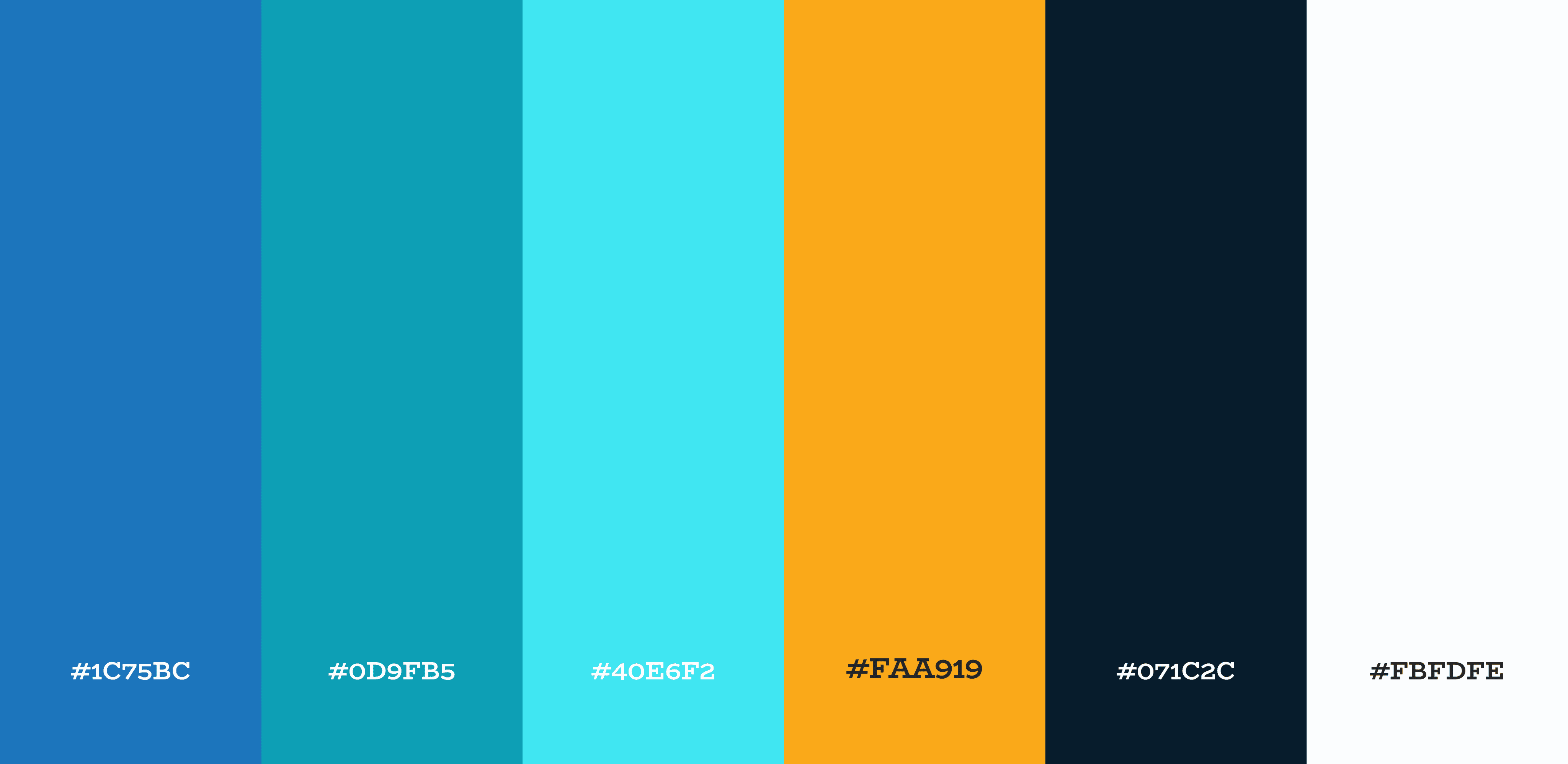
Colour Style

Components

Typography (Inter)

Icons
REFLECTION
What I learned
Working on Palmlingo taught me how critical observation, empathy, and iterative design are when creating experiences for users with unique communication needs.
This project reinforced the importance of designing for user intent rather than feature parity. By focusing deeply on the learning experience, we created a clearer, more supportive path for users who want to build long-term communication skills.
Usability testing validated the decision to separate learning from translation. Learners completed tasks faster, reported lower cognitive load, and expressed higher confidence when the experience was tailored to learning-specific goals.
In summary, this project taught me that Inclusive design requires respecting independence. Many Deaf users prefer autonomy and only accept help when requested. Designing optional guidance rather than forced prompts fosters a respectful, empowering experience.


Colour Style
Components
Typography (Inter)
Icons
The Solution
A sign language translation app that enables real-time communication, by translating sign language to text, text and audio to sign language, and also supports easy sign language learning. It also offers games that sharpen your signing skills.


INTRODUCTION
Palmlingo is a sign language app designed to bridge communication gaps between Deaf users and non-signers through real-time translation and accessible learning. This case study focuses on designing the learning experience, informed by research and usability testing.
INTRODUCTION
Palmlingo is a sign language app designed to bridge communication gaps between Deaf users and non-signers through real-time translation and accessible learning.
This case study focuses on designing the learning experience, informed by research and usability testing.
CHALLENGE
Deaf users and sign-language learners lack a simple, reliable way to communicate with each other in real-world situations.
The challenge was to bridge the gap between sign-language learning and real-world communication by creating a single, intuitive product that serves multiple user groups without compromising accessibility.
CHALLENGE
Deaf users and sign-language learners lack a simple, reliable way to communicate with each other in real-world situations.
The challenge was to bridge the gap between sign-language learning and real-world communication by creating a single, intuitive product that serves multiple user groups without compromising accessibility.
The Solution
A sign language translation app that enables real-time communication, by translating sign language to text, text and audio to sign language, and also supports easy sign language learning. It also offers games that sharpen your signing skills.
MY ROLE & SCOPE
The Learning Experience
My design focus was on the learning flow, where users want structured, low-pressure guidance rather than speed or accuracy alone. The learning flow supports users who want to gradually build sign language skills through guided lessons, practice, and feedback. The goal was to make learning feel approachable, engaging, and repeatable.
Easy Onboarding: Translator vs Learner
Users are guided to select whether they want to translate or learn from the very first screen. This ensures they only see the tools and lessons relevant to their goals, reducing cognitive load and improving adoption.
Sign to Text
Image capture converts user’s sign language into text in real time. Enables smooth conversations for Deaf users with non-signers.
Colour Coded Confirmation Feedback
Visual cues let users know messages were understood. Reduces miscommunication and frustration.
Audio to Sign
Non-signers can speak, and the app shows it in sign language. Bridges the communication gap instantly.
Quick Conversation Mode
Optimized for public interactions with minimal setup. Reduces friction in everyday real-world conversations.
Text to Sign
Non-signers can type, and the app shows it in sign language. Bridges the communication gap instantly.
RESEARCH
How might we help non-signers learn and communicate sign language better?
Before designing, I focused on understanding what successful communication looks like for users. I researched all types of users and organized research insights through an affinity map, highlighting patterns and key needs.
By studying how non-signers naturally communicate, including body language, facial expressions, lip reading, and hand gestures, I translated these cues into a framework for seamless interaction between signers and non-signers on the app.
The goal was to recognize how our target users would react to sign language in a situation where things were not understood. There were two main users to consider:
Translator
Deaf users or non-signers who need to communicate immediately with someone who doesn’t share the same language. The user needs a smooth conversation without awkward pauses or misunderstandings.
Learner
Family members, friends, caregivers, or anyone motivated to learn sign language to communicate more confidently over time. The user wants the ability to communicate without relying on translation tools.
Affinity Map
Cognitive & Linguistic Factors
Language fluency
Grammar differences
Environment noise
Lighting conditions
Speed of interaction
Social setting e.g restaurant, ublic space, etc
Communication Context
Environmental noise
Lighting conditions
Speed of interaction
Social setting e.g restaurant, public space, etc
Cultural and regional issues
Technological Factors
Camera accuracy and lag
Internet connectivity
Device position
UI accessibility
Primary Research
Through research, we found that most sign language app users fall into two groups: those who want to translate sign language and those who want to learn sign language.
We conducted interviews via a video call with 2 sign language app users, to better get an understanding of who we were designing for.
Observational Field Study
To design an effective sign language learning experience, I needed to understand how people naturally communicate when they don’t share a common language. Rather than relying only on interviews, I conducted an observational study to capture real, unspoken behaviours.
This observational study combines non-intrusive, real-world observation of a Deaf user during a public interaction with secondary research from publicly available videos and online Deaf communities. No personal or identifying data was collected. The focus was on communication behaviours rather than individuals.
Observational Example 1:
Giving Directions Without Words
Observational Example 1: Giving Directions Without Words
Scenario: Two people attempt to give directions without speaking.
Observed Behaviours
Pointing and directional hand movements were used first
Gestures were exaggerated for clarity
Facial expressions signalled emphasis or urgency
The “listener” nodded or mirrored gestures to confirm understanding
Insight
Visual cues and confirmation gestures play a critical role in successful communication.
Design Implication
The learning experience should emphasize clear hand movements, facial expressions, and visual confirmation over text-heavy explanations.
Observational Example 2:
Ordering in a Public Place
Observational Example 2: Ordering in a Public Place
Scenario: A Deaf user places an order at a public counter while interacting with a hearing cashier.
Observed Behaviours
The user rarely spoke, not due to inability, but because signing felt more natural from daily use.
When unable to hear the cashier, she signalled misunderstanding by placing her hand near her ear.
Eye contact was maintained throughout the interaction
Close attention was paid to mouth movements and body language
Partial lip reading helped infer some spoken words
The user demonstrated a strong sense of independence and preferred not to receive help unless requested
Insight
For Deaf users, communication is inherently visual-first. Listening happens through eye contact, facial expression, lip movement, and body cues.
Speech may be possible, but signing often feels more intuitive and efficient.
Design implication
Learning experiences should prioritize visual clarity, including facial expressions and body positioning.
Sign demonstrations should include expressive facial cues, not isolated hand movements.
Interfaces should respect user independence, offering guidance without being intrusive.
Supporting awareness of lip reading can complement sign language learning
These observations reinforced that communication without shared language is inherently visual, expressive, and iterative. Successful interactions rely on clarity, repetition, and feedback; principles that directly informed the design of the sign language learning flow.
“The thing is, some of our patients don't speak with their mouths; they do it with their hands. Although not only that! They also use facial and body expression and sometimes vocalizations with or without sound. That is, they speak in sign language.”
source: https://claso.net/en/blog/are-deaf-people-unable-to-speak
From Observation to Interface
The first version of the learning interface was based on primary and secondary research, with major inspiration coming from the observational study, online and offline:
Watching publicly available videos of Deaf individuals communicating across different contexts and age groups.
Exploring online and offline Deaf and sign language communities to observe how signing is used globally
These observations reinforced the importance of expressive, visual, and respectful communication design in my wireframe and design decisions shown below
Observation 1: People rely on exaggerated hand gestures
Clear, deliberate gestures informed the use of slowed, repeatable sign demonstrations
Large hand movements
Sign animations play at reduced speed by default
Real time sign identification
Users can restart gestures/signing
Observation 2: Communication is step-by-step
Breaking communication into manageable steps reduces cognitive load.
Easy Translation Screens
Individual signs per text
Actions should be broken into smaller units
Observation 3: Confirmation signals understanding
Soft feedback reassures learners without interrupting flow.
Visual Confirmation Feedback
Subtle acknowledgment cues
Visual cues highlight hand position or movement path
Observation 4: Misunderstanding triggers iteration, not explanation
Visual hints replace verbal correction to keep learning intuitive.
User Guidance
“Try again” without penalty
No text-heavy error messages or learning guides
Colour-coded error messaging
Visual progress feedback rather than correctness pressure
MARKET RESEARCH
Competitor Analysis
To understand the existing landscape of sign-language and accessibility tools, I analyzed direct and indirect competitors across sign-language translation, learning platforms, and communication aids.
The goal was not to replicate existing solutions, but to identify gaps where Palmlingo could deliver greater clarity, inclusivity, and usability.
USER RESEARCH
Defining Personas
Through research, we found that most sign language app users fall into two groups: those who want to translate sign language and those who want to learn sign language.
We conducted interviews via a video call with 2 sign language app users, to better get an understanding of who we were designing for.
Translator User
Demographics
15 - 25
Student
Sibling to a 16 years old deaf girl
Tools
Pen and paper
No apps
Challenges
Embarrassed to communicate in public with her sister. Having to communicate with pen and paper
Background
Her 16 year old sister has been deaf from birth. They are able to understand her her when she shows them images of what she means
Needs/Wants
She wants to be able to communicate easily with her sister. She wants others to be able to do the same
Learner User
Demographics
25 - 35
Employed
Lives in an Urban area
Tools
A sign language translator app
Challenges
Afraid to start a new learning journey and not finishing
Ineffective sign language apps
Background
Had an aunt who was a sign language tutor
Tried learning sign language in the past
Needs/Wants
Wants to learn sign language in 4 months
Wants to be able to sign generally
Personas
We had two primary personas who had two primary goals in mind: Learn Sign Language & Translate Sign Language.
User Flow
User Interviews
We did interviews with about 4 users, which allowed us gather information about their pain points, expectations, and goals.
USABILITY TESTING
Testing with Users
Aim
Evaluate the usability of Palmlingo’s key features in order to identify friction points, understand user expectations, and improve user satisfaction and retention.
Objectives
Assess ease of use and clarity of Palmlingo’s core translation and learning features.
Uncover potential frustrations or drop-off points in the user journey.
Validate how well the app supports:
Users learning sign language.
Users translating sign language (e.g. in real-time situations).
Aim
Evaluate the usability of Palmlingo’s key features in order to identify friction points, understand user expectations, and improve user satisfaction and retention.
Objectives
Assess ease of use and clarity of Palmlingo’s core translation and learning features.
Uncover potential frustrations or drop-off points in the user journey.
Validate how well the app supports:
Users learning sign language.
Users translating sign language (e.g. in real-time situations).
6 Users
Sign Language Learners: 4
Users trying to translate sign language: 2
Testing type:
Moderated, remote (Google Meet, Google Forms), prototype interaction via Useberry for heatmaps and screen recording to see the user actions and behaviors.
Proposed recommendations:
Use familiar icons (1/4 users misunderstood the ‘flash’ icon)
Improve clarity during camera-based sign input with progress or completion indicators.
Expand tap targets to include related icons and adjacent white space when appropriate
Provide clearer visual feedback or hover states (e.g., button shadows, highlight effects).
Sign Language Learners: 4
Users trying to translate sign language: 2
Testing type:
Moderated, remote (Google Meet, Google Forms), prototype interaction via Useberry for heatmaps and screen recording to see the user actions and behaviors.
Proposed recommendations:
Use familiar icons (1/4 users misunderstood the ‘flash’ icon)
Improve clarity during camera-based sign input with progress or completion indicators.
Expand tap targets to include related icons and adjacent white space when appropriate
Provide clearer visual feedback or hover states (e.g., button shadows, highlight effects).
Scenario 1: Ordering food at a cafe
Prompt:
"You’re ordering food at a café. Use the app to communicate with me as if I’m the waiter.”
Tasks:
Launch Palmlingo
Use the camera-to-sign feature to sign or understand a message
Communicate intent clearly using the app
Observed behavior:
Most users navigated to the camera feature easily. Some users struggled with knowing when the app was recording or interpreting
Key quotes:
“The translation screen was easy to understand, but I misunderstood the flash icon, maybe it’s just me”
Prompt:
"You’re ordering food at a café. Use the app to communicate with me as if I’m the waiter.”
Tasks:
Launch Palmlingo
Use the camera-to-sign feature to sign or understand a message
Communicate intent clearly using the app
Observed behavior:
Most users navigated to the camera feature easily. Some users struggled with knowing when the app was recording or interpreting
Key quotes:
“The translation screen was easy to understand, but I misunderstood the flash icon, maybe it’s just me”
Scenario 2: Complete a learning course
Prompt:
"You want to learn sign language to communicate better with your Deaf friend."
Tasks:
Access learning content
Play a game or interactive module
Test out knowledge using translation screen
Observed behavior:
[✓] Users found the “Learn a new sign” section engaging and clear
[✗] Some usability issues with button size action area
[✓] High engagement with Learn section
Key quotes:
“I liked the progress lines in the learning section. The only suggestion I have is maybe you can add a topic on “Objects” in the learning section of the app”
Prompt:
"You want to learn sign language to communicate better with your Deaf friend."
Tasks:
Access learning content
Play a game or interactive module
Test out knowledge using translation screen
Observed behavior:
[✓] Users found the “Learn a new sign” section engaging and clear
[✗] Some usability issues with button size action area
[✓] High engagement with Learn section
Key quotes:
“I liked the progress lines in the learning section. The only suggestion I have is maybe you can add a topic on “Objects” in the learning section of the app”
During testing, multiple users attempted to interact with icons and white space within interface frames.
However, only the designated buttons were interactive. This led to confusion, pauses in task completion, and repeated tapping.
DESIGN SYSTEM
Visual Identity
The colours used for the Palmlingo app were chosen to create a cool, warm, and inspiring experience for the users.
Colour Style
Components
Typography (Inter)
Icons
REFLECTION
What I learned
Working on Palmlingo taught me how critical observation, empathy, and iterative design are when creating experiences for users with unique communication needs.
This project reinforced the importance of designing for user intent rather than feature parity. By focusing deeply on the learning experience, we created a clearer, more supportive path for users who want to build long-term communication skills.
Usability testing validated the decision to separate learning from translation. Learners completed tasks faster, reported lower cognitive load, and expressed higher confidence when the experience was tailored to learning-specific goals.
In summary, this project taught me that Inclusive design requires respecting independence. Many Deaf users prefer autonomy and only accept help when requested. Designing optional guidance rather than forced prompts fosters a respectful, empowering experience.